Research
| poster_annalysis.docx |
Please click on the link above to view my annalysis of film posters.
Scream
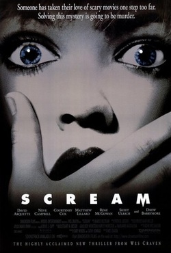
The film 'Scream' was made in 1996 and is a thriller/horror similar to that of our own film. This poster consists of a main image, film title, tag line and billing block. The ideaology behind this poster is that its supposed to keep the audience guessing, much like the film itself.
The main image on this poster is large resulting in it being the posters main focal point. The close up of the young girls face allows us to see her emotion which is clearly that she is shocked. Her eyes seem to follow the viewer, which is to attract their attention and be direct to the audience. The girl is very pale, suggesting either that she is very frightened or has been killed or even that she is a ghost. There are many different possibilities that this image can suggest to the audience which makes them intrigued to find out what is really going on in the film. The girl has a hand covering her mouth, which also suggests different things to the audience. Is it even her hand? And is she covering her mouth because she is shocked? Or it could be someone else’s hand that is covering her mouth to stop her from screaming.
There is also some narrative at the top of the poster in white text. ‘Someone has taken their love of scary movies too far. Solving this mystery is going to be murder.’ This text gives the audience a clearer understanding of what the film will be about because it shows that it will be a film that is based upon finding out who is committing murders. This text also makes the audience feel that the film could be true because it talks about everyday stuff like ‘scary movies’. By talking about a ‘scary movie’ in a scary movie it makes the film feel less fictional.
I think that the ideologies of the film have been portrayed successfully in this film poster because features of the poster suggest and relate to scenes from the film. The poster also lets the audience come to their own conclusions about what will happen in the film and it suggests lots of different possibilities to the audience. Each feature of the poster also follows the same codes and conventions so the theme is consistent.
‘Scream’ is written along the bottom in white, bold, block capital letters. As it is big the audience notices it, because it is big and bold it represents how a scream is because it is big and loud. The title is spaced out across the page; this could represent the length of a scream and show it is long. Also the end letter ‘M’ has been edited. The middle has been stretched downwards so that it has a sharp point. This represents a knife which the victims are killed by.
These subtle changes portray an eerie feeling to the audience which interests them into finding out more and makes them want to see the film. Word of mouth will also support this which is why in our poster it is really important to make the audience think about and question our poster.
The Dark Knight
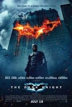
Christopher Nolans 'Dark Knight' film poster portrays a dark, mysterious and eerie feeling to the audience.
The building in the background looks as if it has been damaged, there is a fire on several floors cleverly revealing the Batman logo. It looks very dramatic because the contrast of burnt orange on black attracts the reader's eye. This can be interpreted in many ways, the first being that it symbolises the fall of Batman; the connotations of fire include 'danger'. Leading on from danger, the burning logo may also be seen as Batman's new enemy's warning to him. On the other hand, it may be interpreted as Batman's growing popularity with Gotham city as his logo has been branded into a sky scraper, for everyone to see, including his enemies. Also, the fact that the logo is on the building behind him suggests he has moral support, in other words, he has the whole of Gotham City behind him. The institution's chose the burning logo of Batman to inform the readers that the film contains action and menace. The production team chose the bright colour of the logo to entice readers and, to make it stand out, forcing a passerby to sub-consciously take a mental note of it.
The background itself consists of dark colours and mixes action in with the shards of wood/rubble flying behind the character giving it a sense of frozen action which most viewers will find inticing and interesting, wanting to know what happens and the series of events that lead up to this shot.
The framing of the poster is clever, it allows us to see the majority of the building that appears to be involved in an explosion, yet the low angle shot also allows us to see most of batman, see his clothing and disguise that allows him to become the Batman. He is portrayed as a powerful individual in the poster because of his clothing and the scene behind him, that of explosions and what appears to be distruction. This will appeal to the majority of people who see the poster, they are looking for an action movie and the poster tells them that it is exactly that.
The tagline at the top of the poster gives an indication of the films themes and issues, and what the audience can expect. "welcome to a world without rules" is written in a sightly darker grey compared to the sky so that its not obvious yet stands out at the same time.
I think that our tagline should stand out and get the audience thinking, and our main character should be the focus of our poster. In this poster, batman is important but the focus is on the logo and building behind him, whereas I think we should go for a more simplified look on our poster.
Our Influence
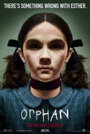
We took a lot of influence from the poster for the film "Orphan", we found the poster to be simple yet effective. The great thing about this poster is that it is visually quite strong in the sense that it gives off a really eery and scary feel to this character without her physically showing that she is a killer or has evil characteristics. We wanted to take this element of the poster and put it in our poster.
We also looked at all the little extra details that go in to the poster so that we could meet industry standards when producing our poster. Things like the release date of the film are important, the producers of the film, a tag line. The title, a website for audience members to visit to find out more information on the film. All of these little details make up the poster into something that will entice the audience in wanting to go and see the film.
We also looked at all the little extra details that go in to the poster so that we could meet industry standards when producing our poster. Things like the release date of the film are important, the producers of the film, a tag line. The title, a website for audience members to visit to find out more information on the film. All of these little details make up the poster into something that will entice the audience in wanting to go and see the film.
Draft Poster
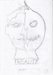
We had an idea that we wanted to follow up after researching film posters. I really liked the look of our influence poster and the simplicity of it, but then I thought we could do something similar but that would almost tell the audience about our film through the use of one image. This is when I thought of using a head shot of our model Ben but then splitting his face in half so that we would show a split personality to our character. One side of his face would portray him to be a normal, sweet and innocent child but the other half would be drawn like a child's drawing that would show him to be something different to what he portrays. And this side would portray him to be a character with a dark side to him.
By using a image like this we would hope that we wouldn't give away the story line of our film all together but we hope it would be strong enough to catch our audience's attention and an image that would make them think "what could this be about" in the hope that they would want to know more about the film, eventually leading them to going to see the film.
By using a image like this we would hope that we wouldn't give away the story line of our film all together but we hope it would be strong enough to catch our audience's attention and an image that would make them think "what could this be about" in the hope that they would want to know more about the film, eventually leading them to going to see the film.
Creation Process


We started off photographing Ben in the green room trying to get a good head shot of Ben, from this we stripped away any colour in the photo and made the image black and white and also tinted the image aswell so that this tied in with the editing we did in our teaser trailer. We then cropped half of Ben's face in half, then by using photoshop we drew the other half of Ben's face, we wanted the drawing to be very rough like a child sdrawing would be, and we hoped that by doing this we would be keeping with the themes of our teaser trailer.
Our poster

Above you can see where we have tried including all the conventions of a film poster. We have placed our tag line right at the top of the poster so that it is one of the first things we would hope our audience would see, we made the tag line short so that it is memorable and it is hopefully something that will play on the target audience's mind. The image is the main focus of our poster and you can see how we have tried playing with the image to portray our character to have two sides to him.
The title is big and we have played with the font so that it ties in with our teaser trailer, the text is dis jointed and has a wave running through it, much like how our teaser trailer had the use of sound waves to exaggerate the radio reports. The title also uses this to keep with the themes that run with our film.
A billing board is used so that we followed industry texts, a billing board is often used for legal reasons more than anything. Information about the film can also be found here as well, such as who produced or directed the film and all the instituations that were involved with the making of the film.
